Visible signs of mental illness

Plug your music, photography, graphics, shows of any kind or other creative works.

Moderated By: mods

User avatar
DGNR8
.
.
Posts: 4220
Joined: Sat Sep 30, 2006 2:51 am
Location: DC Area

Visible signs of mental illness

Post by DGNR8 »

Here's what I painted over the past few months, after a 15 year hiatus. You can see a similarity among them, which is a form I seem to need to fuck around with right now. I started with the tiny globs and exploded into the long sinewy leech shapes. The one called Strand is easily the darkest among them. The palette is dark and grim, and there's something happening in the paint that makes it appear even more stark. But there are actually little stray bits of color that betray a hopefulness. All of these were done in the deepest of depression, but by the time I got to Kernel and Weep I was pulling out of it a little. Fibers is about as small as I would want to work. I think it's 8x10.

Image
Image
Image
Image
Image
Yell Like Hell
User avatar
DGNR8
.
.
Posts: 4220
Joined: Sat Sep 30, 2006 2:51 am
Location: DC Area

Works in Progress

Post by DGNR8 »

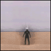
This group shows both the ones I haven't finished, and the process stages of some of the others. I have a sort of fetish about process because it allows us to see how something changed over time. Obviously, if I am not done with something, it may be unrecognizable by the time I finish. I have taken a break in order to move my operations out of the carpeted guest room and down to the guitar lab/painting studio, which has linoleum floors to catch acrylic paint spills. In order to do that, I had to finish up my last few guitar projects. The only thing left is to install a Duncan Antiquity four pole pup in the Mandocaster copy that Aug built.

Okay, I could have retaken the one with the guitar in it. I thought I could throw that in as bait. You can follow along with some of the progress, but a few make radical shifts midway. In some cases you lose great brush work in order to have a better final piece. The one called Kernel was so promising when I made the black outlines for it, but at a certain point I thought it was starting to get too representational and so I overhauled it. Follow your instincts but wear a rubber.

I made very little effort to cover over the framed area that was already painted. I got a few of these old framed works from yard sales and painted over factory prints (or whatever). Both of the two with the white frames has canvas strips glued onto wood. I was determined to paint the image on top, but ultimately caved in favor of the matting. They have the look of old barn relics in person. I can totally see the leap from my work on relic guitars back to this. For one thing I clipped through these and a few others (including massive rework) over the course of only a few months.

What you can't tell in these photos is that the blue Angel with the graffiti swirls is like 4x5 FEET! SHIT IS HUGE. What I will point out in that one only is that there are a few spots I got right on the very first day, and they never changed. By the sixth major iteration I had totally removed the angel's face, when I noticed the better one on the lower left. Then I did some minor emphasis on it to cement it to the rest of the picture. It could be called done, but I would like to tone down the dark, cartoony lines around the swirls. I have given away several of these already, but there are a few that I will keep for myself, even if I have to hang them down in my studio.

Image
Image
Image

Image
Image
Image
Image
Yell Like Hell
User avatar
astro
.
.
Posts: 1765
Joined: Mon Jan 14, 2008 9:04 pm
Location: Montreal

Post by astro »

Really nice stuff, dude!

WANNA SEE MOREZ!

This one is my fav (though they're all good)
Image
arcadedave

Post by arcadedave »

Very nice. Oddly organic looking.
User avatar
DGNR8
.
.
Posts: 4220
Joined: Sat Sep 30, 2006 2:51 am
Location: DC Area

Post by DGNR8 »

Funny you should single out that one, Astro. That's the only humorous one, and in person looks VULGAR. The bottom part looks like a tongue, and the top, well...It's called Octopus, but that's just to distract from what's really going on.
Yell Like Hell
User avatar
Skip
.
.
Posts: 1183
Joined: Mon Sep 01, 2008 11:02 pm
Location: west palm beach fl, USA

Post by Skip »

i really like them
show us more when ready
I would have given up already if it wasn't for the impending revolution!
User avatar
robert(original)
.
.
Posts: 7174
Joined: Thu Apr 20, 2006 12:30 pm
Location: somewhere in the midwest

Post by robert(original) »

they all kinda remind me of human organs
More Cowbell
.
.
Posts: 6206
Joined: Thu Apr 20, 2006 3:31 am
Location: Jefferson, GA

Post by More Cowbell »

Damn DGNR8, your shit is quality. they draw me in, I feel like I could reach into some of your paintings, they are 3d.
User avatar
Diva
Misty Peppers!
Posts: 15100
Joined: Thu Apr 20, 2006 3:42 am
Location: out yo mind

Post by Diva »

robert(original) wrote:they all kinda remind me of human organs
yes, a very internal quality! i like how fluid they look. thumbs up!
gaybear wrote:i <3 diva
User avatar
Pens
less dickface
Posts: 13982
Joined: Thu Apr 20, 2006 4:51 pm
Location: South St. Louis

Post by Pens »

Image

I positively love this painting.
euan wrote: I'm running in monoscope right now. I can't read multiple dimensions of meta right now
User avatar
laterallateral
Traynor or Death
Posts: 5950
Joined: Wed Jan 16, 2008 12:15 am
Location: Montery Howl

Post by laterallateral »

Yep That one, up there is my fav, too.
Really nice work
Last edited by laterallateral on Fri Sep 19, 2014 3:05 pm; edited 115,726 times in total
User avatar
DGNR8
.
.
Posts: 4220
Joined: Sat Sep 30, 2006 2:51 am
Location: DC Area

Post by DGNR8 »

Thanks for all teh kind words. I like that one too, and it flew together. Some are just inspired.

I am probably not going to get back to painting for a while. I need to fix up a Gretsch and the Malikaster, but I have also been cartooning after a very long absence. At least now I know I can go back to painting. I am not afraid of being stuck without ideas. What I hope to do is start to incorporate higher forms of linear art, poetry, and prose into comics. It's what makes sense to me right now. I will post some when I can. Right now. it's lots of sketching.

What's interesting is that I was trying to get away from any kind of representation with the paintings. Comics have to be somewhat representational in order to communicate a story. Jesus--I can't imagine how I would make these paintings into stories, but that's a provocative thought. Are there any abstract comics out there? In any case, I have had to go back to the drawing board, which consists of drawing anatomical figures.
Yell Like Hell
User avatar
handen
.
.
Posts: 181
Joined: Fri Apr 21, 2006 1:15 am
Location: Lethbridge, Alberta, Canada

Post by handen »

DGNR8 wrote:Jesus--I can't imagine how I would make these paintings into stories,
It would defeat the purpose. Unless, like I see some are, you intend a sort of triptych which is already sort of inferred in the one with Jesus on the left, since the triptych is an idea of Christian origin to begin with anyway... Which in a sense makes it seem like an instant cop-out whether or not those were your intentions.
User avatar
Gavin
I Beat BBC News
Posts: 12874
Joined: Tue Apr 18, 2006 11:27 am
Location: Scotland

Post by Gavin »

I like this one on the left best, but I still think you should paint actual things rather than squiggles.

Image
User avatar
mcconnachiea
.
.
Posts: 542
Joined: Fri Apr 17, 2009 11:21 pm
Location: London, innit

Post by mcconnachiea »

That should be painted on a guitar