
once i learn how to print my own t-shirt's we'll get one out to you!westtexasred wrote:Yeah,I like it.I want a T-shirt.
The random works of Ty
Moderated By: mods
-
westtexasred
- Shortscale Cultural Minister
- Posts: 16977
- Joined: Wed Apr 26, 2006 6:10 pm
- Location: Minneapolis
Alright, so I've been doing some research on how to print my own t-shirts, and will try and get one done by next month, when I can get some supplies (shirt and iron on paper).
So onto the newest "piece" just wanted some feedback about this flier I made.
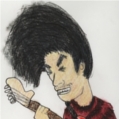
along with the "facepalm" emote I made.

So onto the newest "piece" just wanted some feedback about this flier I made.
► Show Spoiler

► Show Spoiler

-
endsjustifymeans

- Grown Up Punk
- Posts: 19442
- Joined: Tue Feb 10, 2009 4:02 pm
- Location: Ball So Hard University
Get a screen printing/silk screening kit from a craft shop.silly_rabbit_band wrote:good to know, what do you recommend?Gavin wrote:The iron on stuff is shit. It's just cracks and comes off after a few washes.
dots wrote:society is crumbling because of asshoels like ends
brainfur wrote:I'm having difficulty reconciling my desire to smash the state & kill all white people with my desire for a new telecaster


-
westtexasred
- Shortscale Cultural Minister
- Posts: 16977
- Joined: Wed Apr 26, 2006 6:10 pm
- Location: Minneapolis
I like the "Pickels Say'z No"silly_rabbit_band wrote:Alright, so I've been doing some research on how to print my own t-shirts, and will try and get one done by next month, when I can get some supplies (shirt and iron on paper).
So onto the newest "piece" just wanted some feedback about this flier I made.along with the "facepalm" emote I made.► Show Spoiler
► Show Spoiler
Like I stated, feedback, that's the perfect kind of feedback! So, I will make a new better, tidier one, before we start handing them out.Malik wrote:I hate to say, but that flier's pretty horrible. Almost impossible to tell what's going on in the background, too much contrast for it to be in monochrome, and the text isn't tidy at all. It's just messy I'm afraid.
Thanks.
I always sound like a jerk when I give feedback, I can't help it.silly_rabbit_band wrote:Like I stated, feedback, that's the perfect kind of feedback! So, I will make a new better, tidier one, before we start handing them out.Malik wrote:I hate to say, but that flier's pretty horrible. Almost impossible to tell what's going on in the background, too much contrast for it to be in monochrome, and the text isn't tidy at all. It's just messy I'm afraid.
Thanks.
Just try to put focus on the important information, it's especially important with fliers but goes with everything. If your viewer only gets to see the flier for two seconds or so, are you confident they'll get all the important information? If all they see is an artsy fartsy (but perhaps overdone) background image, it's a failure! Get that text to stand out.


-
hotrodperlmutter

- crescent fresh
- Posts: 16665
- Joined: Sat Apr 04, 2009 10:29 pm
- Location: Overland Park, KS, USA
unfortunately, still not very good. it's very... childish? in the 80's sort of way. with monochromatic, it helps to use things that appear to have gray area... not just white, or just black. like you've done here. it's not hard to look at, just if i saw it, i would say "i will not come see your band, because this looks as if you don't want me to."silly_rabbit_band wrote:Malik, you didn't sound like a jerk, constructive criticism is always good to hear.
But here is a newer one, I used some random pic I liked that I found on google, and did some editing, text is more clear, and the image is more subtle.
it seems that you're enticing children with such a remedial concept. sry. FYI
dots wrote:fuck that guy in his bunkhole.
-
endsjustifymeans
- Grown Up Punk
- Posts: 19442
- Joined: Tue Feb 10, 2009 4:02 pm
- Location: Ball So Hard University
I think the problem is there are two completely different things going on.Gavin wrote:I don't think the material or that it's monochromatic is the problem, I think it's because the layout could do with a bit more thought, the font is shit and it looks kinda pixelly and shit in general, like it was knocked up using MS Paint.
I like the image, I like the messyness around it. But then you have these pristine sterile ms word fonts... awful. If it's hand drawn, simple and messy then it needs to follow through... the text should be the same way.
dots wrote:society is crumbling because of asshoels like ends
brainfur wrote:I'm having difficulty reconciling my desire to smash the state & kill all white people with my desire for a new telecaster
For the font on the names, I did 2 seperate layers and slightly blurred one and then lowered the opacity, then over layer some odd text above, all of this was done in photoshop, so I'm liking your feed back (I need some good advice for making good fliers).
Will make another one, and post. Keep up with the constructive criticism.
Will make another one, and post. Keep up with the constructive criticism.
-
endsjustifymeans
- Grown Up Punk
- Posts: 19442
- Joined: Tue Feb 10, 2009 4:02 pm
- Location: Ball So Hard University