Page 3 of 4
Posted: Wed Jan 28, 2009 1:14 am
by Ty
It is aimed at the locals, so land mark wise we have 4 choices, the rock (where every one buys drugs from), the covered bridge (located next to the rock), the CG market (where every one buys smokes from), or the park (where every one get's arrested for doing the drugs they buy at the rock). Note: those are all serious, like WAY to serious.
Posted: Wed Jan 28, 2009 1:17 am
by Reece
actually, why don't you try something with a sort of old school punky feel, such as:

it might work with the image you've got.
Posted: Wed Jan 28, 2009 1:18 am
by laterallateral
See, I'm a big fan of repetitive, preferably monochrome motifs for cover art.
Extra points, if it's slightly headache inducing.
Like Pluse Demon from Merzbow.

or really grainy xerox art, like this Einsturzende Neubauten flyer.

Posted: Wed Jan 28, 2009 1:26 am
by Ty
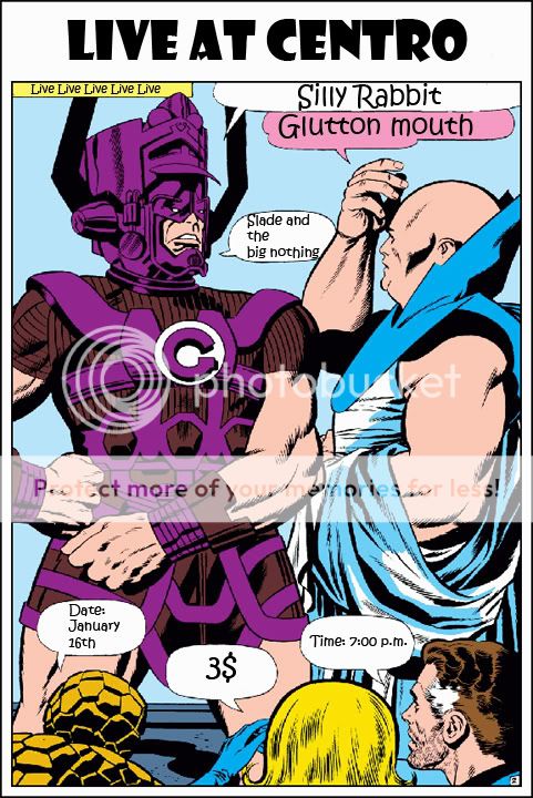
That's not a bad idea our first flier was a Fantastic 4 comic book page I shopped with the details.
But just out of curiosity what is our image? We are a mix of two genres.
(also should post a good band photo)
► Show Spoiler
Us on our "road trip" to Washington it was our first one.
Posted: Wed Jan 28, 2009 1:27 am
by Reece
i meant image as in picture

Posted: Wed Jan 28, 2009 1:27 am
by laterallateral
Your choice could'nt be clearer: do a xerox art collage of the four landmarks.
Call it "Small Town Leisure Centres".
Posted: Wed Jan 28, 2009 1:28 am
by Reece
write SRB on your arse and then xerox that. done.
Posted: Wed Jan 28, 2009 1:32 am
by Ty
Zaphod wrote:write SRB on your arse and then xerox that. done.
laterallateral wrote:Your choice could'nt be clearer: do a xerox art collage of the four landmarks.
What about for the back to what Zaphod wrote, and front will be laterallateral's idea.
I will shop something up in the morning when I have access to photo shop.
Posted: Wed Jan 28, 2009 1:34 am
by serfx
since you don't have the photoshop at home, hook yourself up with the gimp, learning curve is a little steep but if you know PS, then you should be alright
and then you could do mock ups tonight
link!
i'm a fan of the more diy sketch idea that lat proposed though
but i haven't heard any of your stuff. however you can never go wrong with it.
NEVER!
Posted: Wed Jan 28, 2009 1:35 am
by laterallateral
IN YOUR FACE, ZAPHOD! I GET THE FRONT PAGE!
OMG, OMG, I'D LIKE TO THANK JESUS...
Posted: Wed Jan 28, 2009 1:38 am
by Ty
We have some real sketchy stuff on our page, a bunch of locals like it and we almost have 1500 plays so I guess it can't be bad. And I'm gonna get gimp now.
And once again thank you all for the opinions and ideas.
Posted: Wed Jan 28, 2009 5:55 am
by Ty
So here is a cover idea, I used a picture of the CG armory/town hall.
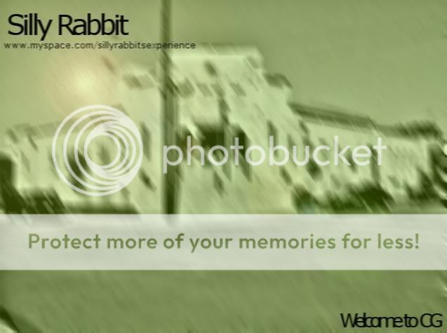
I added motion blurs a "xerox" style filter, the green color like DGNR8.
Currently working on the back cover.
Posted: Wed Jan 28, 2009 8:52 am
by gaybear
that last one is very nice. not sure it fits your sound. but who cares.
Posted: Wed Jan 28, 2009 9:23 am
by laterallateral
the new one is P.I.M.P.
I haven't heard your sound but I know this will work. Like Wilco. They have album covers that couldn't be any LESS evocative of the music they make.
Posted: Wed Jan 28, 2009 9:29 am
by gaybear
keep the font, and just change it to super lite green (use dropper) and i thin you're done. looks semi==pro
Posted: Wed Jan 28, 2009 4:14 pm
by Ty
I was thinking about making it yellow, or printing on yellow paper. Thanks for the comments, on the new art, currently working on the back cover.
Posted: Wed Jan 28, 2009 10:29 pm
by DanHeron
completely ripping off one of the albums posted above, here's an idea:

Posted: Wed Jan 28, 2009 10:40 pm
by Ty
That's actually not to shabby, I like it, is it ok if I steal your work?(might use it on our page)
Posted: Wed Jan 28, 2009 11:00 pm
by DanHeron
Go for it yeah, i don't mind.
Posted: Wed Jan 28, 2009 11:04 pm
by Ty
Cool, thanks just thought I would get permission first.