with the right filters, almost any photo can work.
also, screen printed or stenciled cover art is easy to do, looks rad, and is sort of "as good as it can possibly look," if that makes sense. if you use a straight up photo, it better be a fucking GREAT photo. if you use a drawing, only a fucking awesome drawing will look pro at all. but a high contrast screenprint can look pro when its totally fucking not. fucking.
rip off one of these.

take a semi interesting or evocative photo, xerox it, and color it with crayola markers

pretty much all of the smiths covers are monochrome, sort of low contrast photos of people. and they are awesome. beware that deerhunter recently did this one, so make it not like theirs at all. and no stupid skull eye thing either.


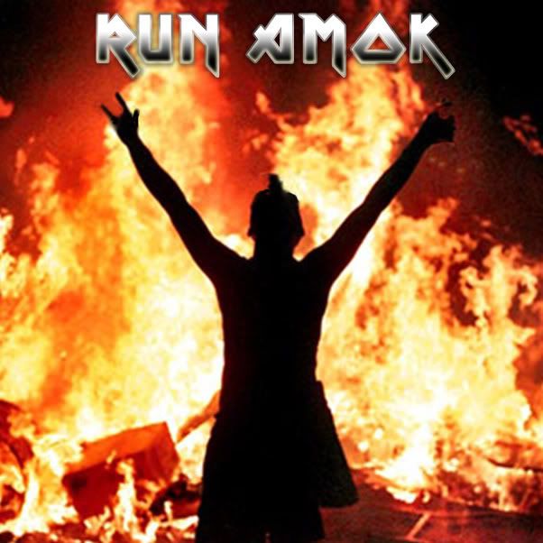
hilariously to the point and evocative of the same feeling as the music within. this is always good. and its an example that you cant really go wrong with super fucking high contrast for looking semi pro. you can use that look until you die.
that last one you posted (the green blurry one) is pretty good, but im not sure if you will attract the right audience. not sure that potential fans will associate that look with your sound.
also, id leave the myspace URL off the front. as a rule, putting teh internetz prominently on anything makes the thing look like its from 1999. put whatever on the back, but the front should have just the art, imo.