Page 1 of 2
possible albums covers
Posted: Tue Dec 05, 2006 3:26 am
by robert(original)
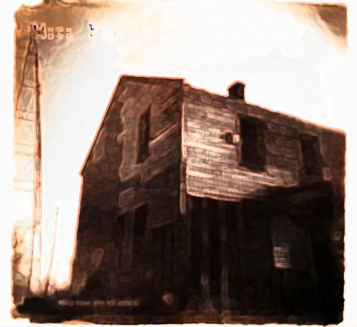
i want you guys to give a bit of feedback on two album covers that my girlfriedn and i worked on,(well only she did really)
one is a pic that i know a few of you have already seen before and another is of our dog fek.


Posted: Tue Dec 05, 2006 3:32 am
by Billy3000
I think the dog pic is just too cutesy, and the top one looks like it needs to be the movie poster for Saw 4 or something.
Posted: Tue Dec 05, 2006 3:33 am
by Gavin
The house is way better. The dog just looks amateur. It would probably be hard to reproduce alot at that quality as well. There should be a question mark after "What have you left behind" though.
Posted: Tue Dec 05, 2006 3:52 am
by James
I think it would look better if you took the dog picture and had it with a border, and then resized it to take about 1/4 of the area. Then have black around it or something. Having it centred would look very 80's but you could always try it in other places.
Basically what I'm saying is this looks too much like a picture with some text stuck on top and not enough like an abum cover.
Thinking about it, that suggestion isnt even that good. Perhaps you should just try and do more with the text.
I'm fairly indifferent when it comes to a preference, but the first one makes you look like a dark metal band, and the second makes you look like a feeder style indie band. Those are just impressions though, it would be what i would expect to hear if i saw a friend pick up a cd with those covers and start to play it.
I don't mean to sound like Mr. Negative, I'm trying to offer constructive criticism. Basically the images are cool, but look unprofessional and mostly its the juxtaposition of the image and text, sort that out and it doesnt particularly matter which one you pick. Props on the poll though, polls like this are always good.
Posted: Tue Dec 05, 2006 4:46 am
by Sloan
put some naked stuff on it.
Posted: Tue Dec 05, 2006 4:57 am
by robert(original)
personally, i can think of three bands that have dogs on the front covers of thier albums. i would think of a metal band as having a severed head or something, not really an abandoned house. the house reminds me more of a blue grass(eee) type of folk thing. the dog remind me of dino jr or something.
give me an example of a proffesional type text and i will give you an example of someone that spent way too much time on the way the words look rather than the music.
sloan, i will totally put your naked ass on the inside cover if you give a pic!!!!

we just kinda threw both ideas together in about 15 mins and decided that either one of them would suite us well.
Posted: Tue Dec 05, 2006 5:15 am
by Billy3000
The mood of the picture of the house makes it look like a metal band's album cover or a scary movie's poster. I can't see that being the cover for a bluegrass album unless it was some dark-ass sounding bluegrass!
And I stick by my earlier statement about the dog picture being too cutesy, doesn't matter what other bands have had dogs on their album cover, that pic looks too cutesy IMO.
Posted: Tue Dec 05, 2006 5:52 am
by Modern Rifles
These are only opinions, but honest ones. They are worth as much as you paid for them.
I agree with Billy. The house looks like something out of the movie The Texas Chain Saw Massacre or some other horror movie. The Dog one looks to cutesy and well like someone said....amateurish. If I had to pick one of the two I would pick the house. I would move the name of the album out of the bottom of the picture. There are a lot of dark colors there and the text is in a dark color. It is very hard to read.
Posted: Tue Dec 05, 2006 6:42 am
by Pens
The house looks really delta blues or roots-folkish. The dog, I just simply don't think is album cover material. Now, I could do some photo processing and filtering on the dog to MAKE it album-coverish, but as-is I wouldn't use that one.
Again, house is very floor-stompin' hand-clappin' campfire blues and folk looking to me. It got my vote.
Posted: Tue Dec 05, 2006 9:05 am
by Doog
Gavin wrote:The house is way better. The dog just looks amateur
I'd go along with that. And agree with Bobster, the dog pic is pretty good, but the way it's laid out look like you threw it together in a few minutes. Then again, have you
seen Graham Coxon's album covers??
The Casa Bonita EP is now titled "To Bedford Street And Supermarket" after me and Mr Drums saw a sign displaying as such in Bognor, rolls off the tongue nicely. I guess Wikipedophilia is gonna be a song title..
Posted: Tue Dec 05, 2006 9:17 am
by theshadowofseattle
Sloan wrote:put some naked stuff on it.
POUR SOME BEER ON IT
Posted: Tue Dec 05, 2006 9:25 am
by Thom
Definitely the house
Posted: Tue Dec 05, 2006 1:17 pm
by James
robert(original) wrote:give me an example of a proffesional type text and i will give you an example of someone that spent way too much time on the way the words look rather than the music...
..we just kinda threw both ideas together in about 15 mins and decided that either one of them would suite us well.
Obviously you care a fair bit about this project considering you're lookng at releasing an album of sorts. Obviously the music is more important than the artwork, but the artwork will often be seen before the music is heard.
If you really believe what you just said, why did you go to the trouble of putting the ideas together at all? Why not just get a load of pieces of 12cm square paper, scribble your band name and album title on one, and then photocopy it onto the rest.
Also, an awful lot of bands, even on the kind of scale we're looking at here, will have someone else put together the artwork for them. The argument that the time they spent making it look good is lost time for making the music sound better is one of the more stupid arguments I've heard on this forum.
Posted: Tue Dec 05, 2006 1:31 pm
by Doog
robert(original) wrote:
give me an example of a proffesional type text and i will give you an example of someone that spent way too much time on the way the words look rather than the music.
It's not like you can't spend a decent amount of time on both, though.
Posted: Tue Dec 05, 2006 1:46 pm
by Mike
We always outsource that stuff to our more visually talented friends and family:


And Robert you're really not taking constructive criticism very well here - people are making valid points.
Posted: Tue Dec 05, 2006 1:51 pm
by Hurb
you nearly had it right with the first one...you just needed some cheapo photobucket effects..

Posted: Tue Dec 05, 2006 1:56 pm
by Mike
Hurb, you're like the worst at photoshop ever.
Posted: Tue Dec 05, 2006 1:57 pm
by Hurb
Mike wrote:Hurb, you're like the worst at photoshop ever.
aye.

Posted: Tue Dec 05, 2006 1:58 pm
by robert(original)
my original idea was to just print up the names of songs and band name and album name, cut it out adn tape it on top of a cd case. thats it.
i wanted to go as cheaply as possible so i wouln't have to spend to much and so we wouldn't have to charge too much either. and hey, since it was done in a few mins i wold mind some ideas about what to actually do to the pics or if you think an idea might be good but the particular pic sucks.
Posted: Tue Dec 05, 2006 1:58 pm
by Mike
I love it though. When you took that brilliant Weezer parody with Yun and made it suck... pure genius. You can't teach that shit.