Page 1 of 2
Moderne of Dumb
Posted: Fri Nov 01, 2013 12:14 am
by DGNR8
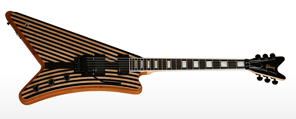
This new Zack Wylldzljde guitar looks like a vintage swimsuit.

Posted: Fri Nov 01, 2013 12:36 am
by robert(original)
oh no.....
Posted: Fri Nov 01, 2013 1:25 am
by Freddy V-C
I actually think that looks cool as fuck.
Posted: Fri Nov 01, 2013 1:29 am
by BillClay
That's the only moderne I've ever liked.
Posted: Fri Nov 01, 2013 3:18 am
by 61fury
me too^
Posted: Fri Nov 01, 2013 6:52 am
by paul_
lol @ switch
Posted: Fri Nov 01, 2013 9:30 am
by Dave
It would have looked better with the Target stripes, with the bulls eye up on the top horn and spreading across the guitar. That line work just makes it look weird and cramped and kind bleeeeeeuugghhh
Posted: Fri Nov 01, 2013 5:04 pm
by jcyphe
UGHHH
That's about the only Moderne I've seen that I don't like.
Posted: Fri Nov 01, 2013 5:12 pm
by cur
jcyphe wrote:UGHHH
That's about the only Moderne I've seen that I don't like.
Posted: Fri Nov 01, 2013 5:37 pm
by Ankhanu
I'm a little torn on it. I like it, but, something about the line choice doesn't sit right... but not THAT wrong, neither

Posted: Fri Nov 01, 2013 9:19 pm
by Bacchus
It looks like spare lumps of Randy Rhoads' pinstripe v.
Posted: Fri Nov 01, 2013 9:35 pm
by paul_
It's like he raided Randy and Dimebag's houses while drunk/crying.
Posted: Fri Nov 01, 2013 10:32 pm
by jcyphe
paul_ wrote:It's like he raided Randy and Dimebag's houses while drunk/crying.
ahahahahaha
Posted: Sat Nov 02, 2013 1:04 am
by DGNR8
Posted: Sat Nov 02, 2013 1:26 am
by BobArsecake
It's a V for the older gentleman, you can actually sit to play it. These rock stars be agein'.
Posted: Sat Nov 02, 2013 9:50 am
by Concretebadger
So instead of hitting the toggle with your strumming hand while playing, you knock it with your elbow. Bravo Gibson.

The weird shape I can understand for the seated playin thing, but the stripes look 'off' and that toggle position is idiotic. Imagine the hassle they'd have to go to to fit the switch and jack right up there. I don't get it.
Posted: Sat Nov 02, 2013 10:15 am
by timhulio
Don't actually dislike it that much. Not sure about the bright white blocks and binding with the vintagey stripes.
Posted: Sat Nov 02, 2013 11:19 am
by Fakir Mustache
I'm not really sure I understand that picture. It looks like the scratchplate is placed wrong and goes off the top of the guitar.
Posted: Sat Nov 02, 2013 12:28 pm
by Nick
I like the stripes. Wtf on the switch placement, ew on the floyd rose and as tim mentioned the bright white makes it look like they didn't think about the aesthetic as a whole when binding it.
Posted: Sat Nov 02, 2013 4:39 pm
by ekwatts
Like it. It's weird and stupid enough that I think it's pretty cool.